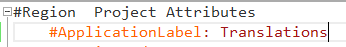
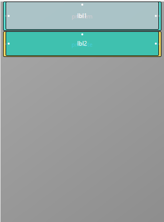
3. RTCSSingle layout
For the display of the notes we will be using the code from Andrew (Digitwell solutions). Link:
ResizingTextComponent. Thank you Andrew for sharing this code!
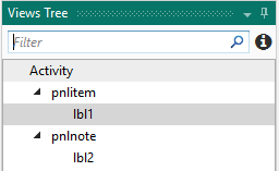
Go to the designer and make a new file and name it: RTCSSingle
In this layout there is only one view: a ResizingTextComponent.
This is a CustomView that will be available if we add the class to the project.
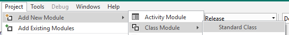
Let's add a standard class tab with the name ResizingTextComponent.
This component uses the StringUtils library so add it to the library list.
Click on the ResizingTextComponent tab in the IDE.
Copy this code in the tab replacing the existing code:
#DesignerProperty: Key: TextColor, DisplayName: Name Color, FieldType: Color, DefaultValue: 0xFF000000, Description: Text Colour
#DesignerProperty: Key: BackColor, DisplayName: Background Color, FieldType: Color, DefaultValue: 0xFFFFFFFF, Description: Background Color

Sub Class_Globals
	Private mEventName As String 'ignore
	Private mCallBack As Object 'ignore
	Public mBase As B4XView
	Private xui As XUI 'ignore
	Public Tag As Object
	Private tclr As Int
	Private bclr As Int
	Private mcorn As Int
	Private txt As Object
	Private tfnt As B4XFont
	Private lpad As Int
	Private rpad As Int
	Private tpad As Int
	Private bpad As Int
	Private mlbl As B4XView
End Sub

Public Sub Initialize (Callback As Object, EventName As String)
	mEventName = EventName
	mCallBack = Callback
End Sub

'Base type must be Object
Public Sub DesignerCreateView (Base As Object, lbl As Label, Props As Map)
	mBase = Base
	Tag = mBase.Tag
	mBase.Tag = Me
	mBase.Color = Colors.Transparent
	tclr = xui.PaintOrColorToColor(Props.Get("TextColor"))
	bclr = xui.PaintOrColorToColor(Props.Get("BackColor"))
	#if b4a
	tfnt = xui.CreateFont(lbl.Typeface,lbl.textsize)
	#else
	tfnt = lbl.Font
	#End If
	txt  = ""
	lpad = 10dip
	rpad = 10dip
	tpad = 10dip
	bpad = 10dip
	mcorn = 0
	Private llbl As Label
	llbl.Initialize("lbl")
	#if b4i
	llbl.Multiline = True
	#end if
	mlbl = llbl
	mBase.AddView(mlbl,lpad,tpad,mBase.Width-(lpad+rpad),mBase.Height-(tpad+bpad))
End Sub

Private Sub Base_Resize (Width As Double, Height As Double)
	mlbl.SetLayoutAnimated(0,lpad,tpad,mBase.Width-(lpad+rpad),mBase.Height-(tpad+bpad))
	draw
End Sub

public Sub setText(t As Object)
	txt = t
	draw
End Sub

public Sub setTextColor(clr As Int)
	tclr = clr
	draw
End Sub

public Sub SetBackColor(clr As Int)
	bclr = clr
	draw
End Sub

public Sub SetTextFont(fnt As B4XFont)
	tfnt = fnt
	draw
End Sub

public Sub SetPadding(l As Int, t As Int, r As Int, b As Int)
	lpad = l
	tpad = t
	rpad = r
	bpad = b
	draw
End Sub

public Sub SetCorners(c As Int)
	mcorn = c
	draw
End Sub

public Sub GetHeight As Int
	Return GetPerfectHeight
End Sub

private Sub draw
	If (mBase.IsInitialized And mlbl.IsInitialized) Then
		mBase.SetColorAndBorder(bclr,0dip,Colors.Transparent,mcorn)
		mBase.SetLayoutAnimated(0,0,0,mBase.Width,GetPerfectHeight)
		mlbl.SetLayoutAnimated(0,lpad,tpad,mBase.Width-(lpad+rpad),mBase.Height-(tpad+bpad))
		mlbl.Font = tfnt
		mlbl.TextColor = tclr
		mlbl.Color = bclr
		XUIViewsUtils.SetTextOrCSBuilderToLabel(mlbl,txt)
	End If
End Sub

#Region multiline DrawText
public Sub GetPerfectHeight As Int
	If mlbl.IsInitialized Then
		Private h As Int = (MeasureMultiTextHeight(mlbl, mBase.Width-(lpad+rpad), txt) + tpad + bpad)
'		Log("perfect height = "&h)
		Return h
	End If
'	Log("imperfect height = "&mBase.Height)
	Return mBase.Height
End Sub

Public Sub MeasureMultiTextHeight(lbl As Label, width As Int, text As Object) As Int
	#if b4a
	Private su As StringUtils
	Return su.MeasureMultilineTextHeight(lbl, text)
	#else if b4i
	Dim plbl As Label
	plbl.Initialize("")
	plbl.Width = width
	plbl.Multiline = True
	XUIViewsUtils.SetTextOrCSBuilderToLabel(plbl,text)
	plbl.SizeToFit
	Return plbl.Height
	#End If
End Sub
#End Region
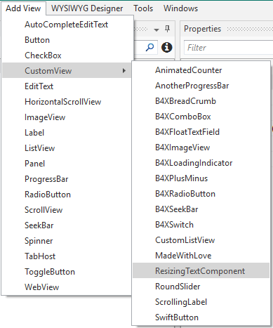
Now you can return to the designer window and continue with the RTCSSingle file.
The CustomView is now available:
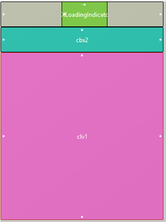
Add the component and anchor it horizontally. You can set the height at 250dip.
Click in the IDE on the Main tab, go to the designer and generate the member save the file and go back to the Main window.
Now let's write some more code.